Right
News
榮獲2021年MUSE DESIGN GOLD WINNER ,獲獎作品"New charm,the one of sky"
110-11-02
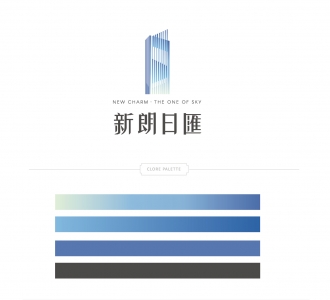
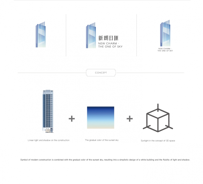
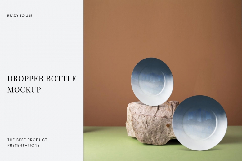
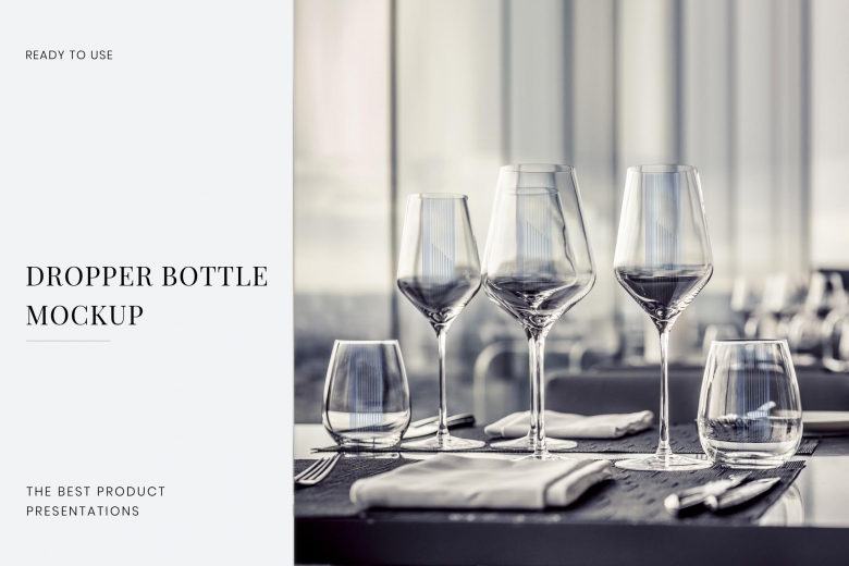
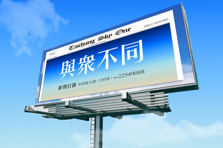
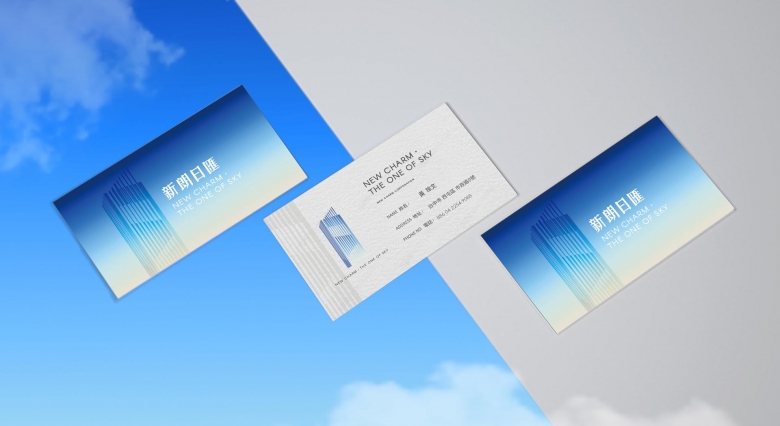
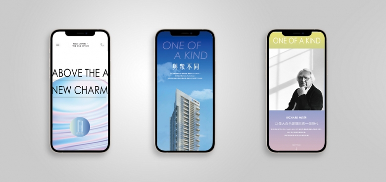
The residential building was designed by Richard Meier, the master of White architecture. In response to the bustling era nowadays, the white building is the medium to reflect the relationship between space, dimension, and aesthetics of light and shadow. With a great amount of glass panels on the facades and use of windows, each unit enjoys three-sided natural lighting and decent ventilation. The building can thus interact beautifully with the urban environment and natural landscape. The main visual and conceptual design is composed of three elements: the linear outline of the construction, the gradual color of the sunset sky, and the light/shadow depicted with the concept of 3D space. Just like Richard Meier’s passion and insistence on white, “Whiteness, in a sense, reflects nature, light, it makes you more aware of the colors of nature,” the design echoes Richard Meier’s architectural design concept. The logo depicts the city skyline and fluidity of light and shadow reflecting on the simplistic design of the white building. It results in a building volume logo, a symbol of modern construction. In addition, the merchandise, such as mugs, wine glasses, and plates, is designed with the three primary symbols: natural elements, gradual color of sky, city skyline. The mugs applied warm pastel colors, pastel pink of pink salt image and light linen color of grain image, each representing sea and land. As for the plates, the gradual blue-sky color on the round plate interprets the rising sun and the sunset sky. The wine glasses with the building lines, depicting the gleamingly skyline on the transcendent glass material.
Credits
THAT'S RIGHT Planning Consulting Co., Ltd.
LIN HUI-LING
THAT'S RIGHT Planning Consulting Co., Ltd.
WANG SHIH-YUN
THAT'S RIGHT Planning Consulting Co., Ltd.
HSIEH HSIN-YING
